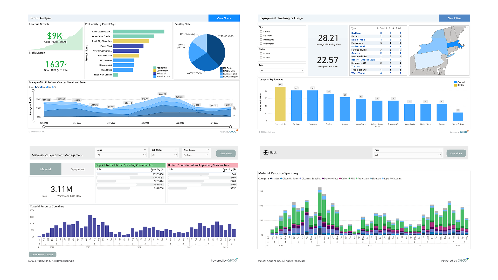
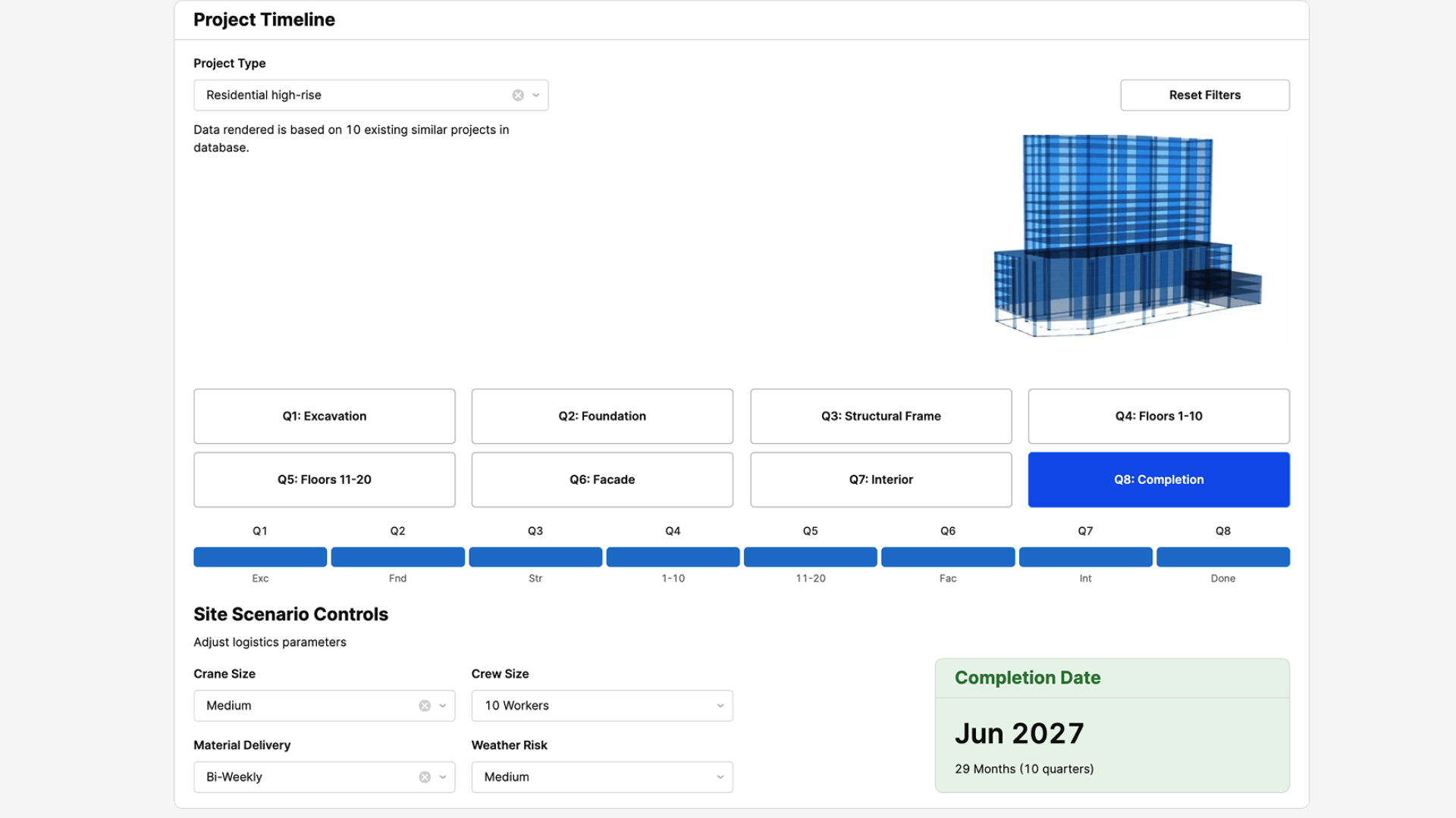
Transforming User Stories into Solutions

client:
Aedo AI.Inc
project type:
Dashboard Design
project year:
2023
TOOLS USED:
Figma, Power Bi, Claude 4 (AI note-taking), Typeform (user discovery surveys)
In this project, I designed a dashboard tailored to the needs of construction executives, helping them monitor project progress with greater clarity. Starting from user stories such as “As a project executive, I want to see milestones at a glance so I can track delays,” I mapped user goals into clear, actionable interface components. The resulting design transforms complex construction data into a structured, intuitive dashboard experience.
Process from user stories to KPIs, benchmarks.Process from user stories to KPIs, benchmarks.
Dashboard showing project gains, losses, time allocations, and delayed project alerts.Dashboard showing project gains, losses, time allocations, and delayed project alerts.
Screenshot of a dashboard displaying various graphs tracking project progress, including line charts, bar graphs, and status indicators representing milestones, task completion rates, and timelines.Screenshot of a dashboard displaying various graphs tracking project progress, including line charts, bar graphs, and status indicators representing milestones, task completion rates, and timelines.
Dashboard showing staff allocation, field-to-office staff ratio, and workload distribution.Dashboard showing staff allocation, field-to-office staff ratio, and workload distribution.
Actuals vs. budgets insights across cost codes.Actuals vs. budgets insights across cost codes.
No items found.

Explore More: